“The button on the right looks weird on my phone.” If you build websites for clients, you have read that email. Here is why feedback by email goes wrong, and what a report you can actually fix contains.
The email
It is launch week. The client opens the staging site between meetings, on whatever device is in their hand, and writes down what bothers them. Eleven points, numbered, some with screenshots pasted inline, one with a photo of their monitor. A colleague replies-all with three more.
Then you start the real work, which is figuring out what each point means.
- Which page? “The services page” could be one of four.
- Which element? “The button on the right” depends on the screen width.
- Which device? Their phone. Which phone? Which browser?
- Is it still true? They looked yesterday. You deployed twice since.
- Is it done? Point 7 was fixed, then reopened in a different thread.
None of this is the client's fault. They are describing a visual thing in words, from memory, without the details only a developer knows to ask for. The email is doing a job it was never built for.
What it costs
The fix itself is often two minutes: a colour, a margin, a line of copy. The back and forth around it is the expensive part. A question, a wait, an answer that raises another question, a screenshot of the wrong page. Multiply by every point on every list on every project, and a lot of a studio's week goes into translation.
What a fixable report contains
Every feedback point a developer can act on straight away has the same parts:
| Part | Without it |
|---|---|
| The exact page address | You guess between similar pages. |
| The exact element | “The button” could be any of six. |
| A screenshot of that moment | You cannot see what they saw. |
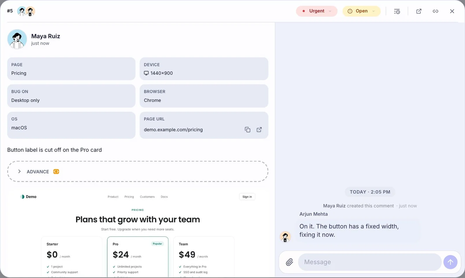
| Browser, OS and screen size | You cannot reproduce it. |
| What they expected instead | You fix the wrong thing well. |
| A status | Nobody knows what is done. |
Clients can supply the last one easily (“make it green”). The other five are hard to write down and easy to capture automatically.
Let them point instead
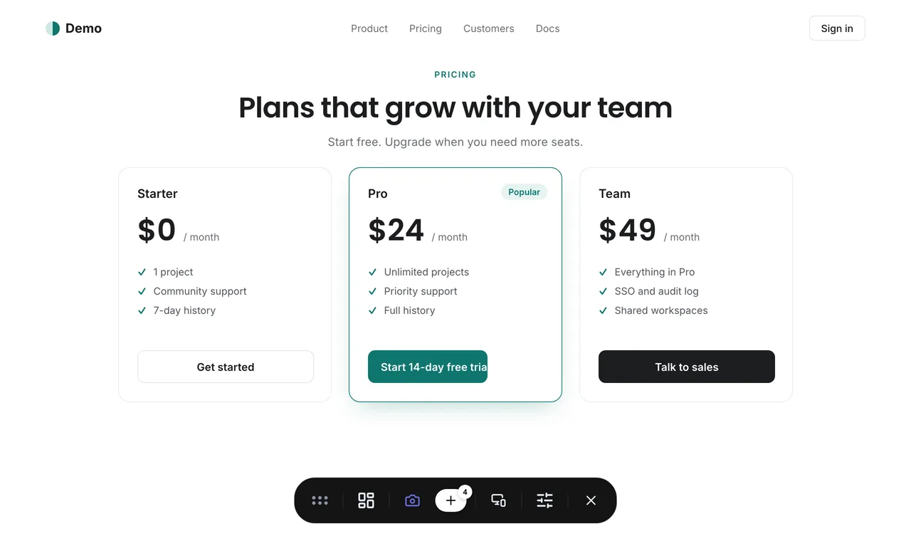
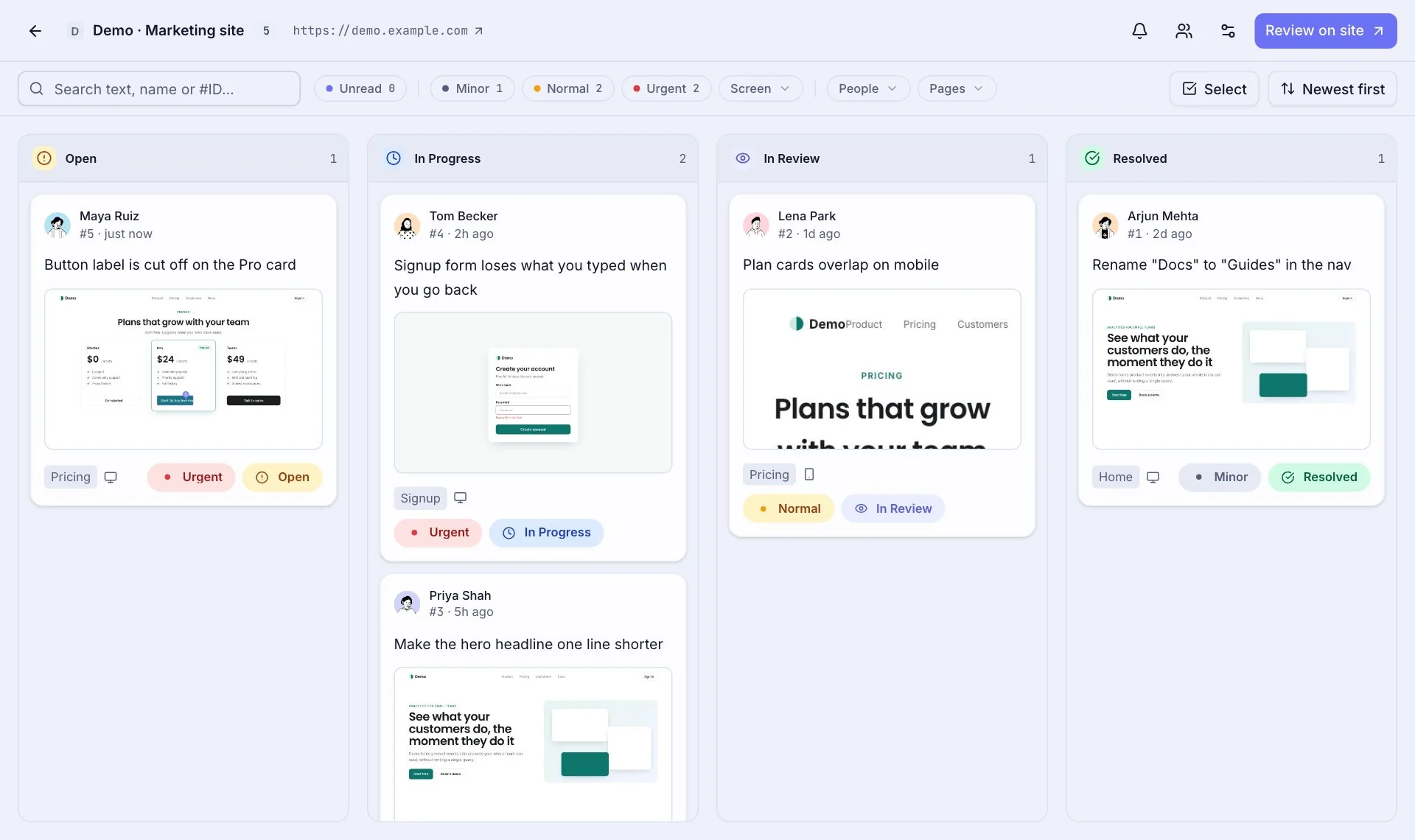
That is the idea behind ReviewMySites. Instead of describing the button, the client clicks it, on the live site, and types what they want. The page, the element, the screenshot, the browser and the screen size go along by themselves, and the comment lands on a board where it has a status until it is done.
The client does not install anything or make an account. You send a link, they comment with a name and an email. The eleven-point email becomes eleven pins, each on the thing it is about.
If you want to try it on your next project, the Free plan covers one site with no card. Getting started takes about five minutes.